Our Blog

Get more retweets, CoPromote

I just discovered this new Twitter tool, and I really wanted to share it. Thing is, if you find it useful, it will help me also…

CoPromote App

CoPromote is an app that finds like minded content for you to earn retweets, by retweeting others. It has a paid version that has unlimited retweets, but the free version allows you to earn retweets for retweeting others. Check it out, I think you will find it as useful as I do. Make it a part of your daily routine, it will only take a few minutes until you hit the limit…

CoPromote App

Read more →

10 Secrets to success you can learn from Albert Einstein


I took 10 famous quotes from Albert Einstein and applied rules of business to them.

I have long admired the theoretical physicist from Germany. He won the 1921 Noble prize for Physics, but he he is most famous for E=mc2. Some call the most famous equation ever! While visiting America in 1933, Adolf Hitler took power, and Einstein did not return to his homeland. in 1940 he became and American citizen. While WWII was brewing, Einstein alerted FDR to the research being done in other country with Nuclear fission, and encouraged America to do the same. Later known as the Manhattan Project, it should be said Einstein was against actually using the newly found weaponry.

He passed in 1955, but will long be remembered as a man who really made a change in the world.

I hope you enjoy this SlideShare presentation, please leave your comments below.

Read more →

How to build a Social Media Marketing Plan

Social Media Marketing is intimidating for many people, sure they have Facebook accounts, and they engage their friends, but when it comes to their business pages they are not sure what to do.  Many people will just create a page, ask their friends to like it, and then never go back… They don’t engage their clients, and more importantly they don’t give the client anything to engage.
In this presentation you will learn about the top Social Media Platforms, and some insight as to how to create a formula for success building a Social Media Marketing strategy.
Please leave comments below if you enjoy.
Read more →

2013 wrap up of Facebook image sizes

Pictures are very important media to you with your blog articles and social media. Facebook has changed a few things this year so I thought I would write this blog article as a wrap up for the end of 2013.

The Facebook Cover Photo Size

The panoramic image at the top of your Facebook profile or page is called the cover photo. The area displayed is 851 pixels wide by 315 pixels high.  In theory the best thing to do is resize your image to the correct size before uploading it, however you can upload any image into this space that is at least 399 pixels wide. A photo that is at least 720 pixels wide will look the best while a picture that is larger than the required size will allow you to move it around and select (crop) the area you want to display.

To update your cover photo, click on the  change cover button.

Change Cover photo on Facebook

If you have not yet added a cover photo you will receive the following warning

fb_warning

After you have added your cover photo, you may want to change it from time to time.  You can change your cover photo anytime by mousing over the lower right hand corner of cover photo.  When you do so the change cover button will appear. If you click on it an additional menu will appear; where you want the

change_cover2

picture to come from. It will look similar to this, you can choose from an existing photo, upload a new one, or delete the current one. You will also have the option to reposition your photo , however if you followed the above instructions, you will not be able to as it will already be the perfect size.

“To get the fastest load times for your Page, upload an sRGB JPG file that’s 851 pixels wide, 315 pixels tall and less than 100 kilobytes. For images with your logo or text-based content, you may get a higher quality result by using a PNG file.” Facebook Advises

 Your Profile Image

The box where your picture of business logo belongs is called the profile picture. It is the smaller square photo on the lower left. This is the image that will shows in the news feed when you comment on another post, or update your status. As long as you make your image a square it will fit in the box properly, it is recommended that you upload a photo of 200 pixels by 200 pixels, however in the end it will only end up being 160px X 160px.

Changing profile picture on facebook


To change your profile photo, hover the photo and click the edit profile picture, here you can choose a photo already uploaded, upload a new one, take a photo if you have a webcam, or edit the thumbnail if you have uploaded a photo that is not a square. Alternatively you can remove your thumbnail, in which case the default Facebook ghost will appear…


To edit the thumbnail when the picture is not a square just drag the image around the box until you have the image showing that you want in the box.

Edit Profile Picture thumbnail on facebook

Profile Image on the Timeline

The profile image that appears next to your name on comments and posts is the same image but is automatically scaled down to 32px by 32px.


Blog URL Shares Thumbnails

Blog share thumbnails on Facebook

Blog share image thumbnails get a little trickier, this is not as cut and dried as the above. Depending on the device Facebook is being viewed on, the thumbnail being displayed will differ. However to be sure the best thumbnail is always displayed your image in the blog article should be at least 560px x 292px. This is the display size for mobile devices, The desktop news feed will show 400 x 209 and in the sidebar it will show 100px by 72 px.  If your image is not at least 561×292 the original thumbnail size of 150×150 will be displayed and the thumbnail will be out to the left of  the description of your article.
I hope this article addresses all the image size questions you have about Facebook, if there is anything I have not addressed here, please feel free to contact us with any questions you might have.
Read more →

Factors for your websites successfulness

While there are different expectations for every website, for them to be successful there are only a few factors that really matter. We have drilled down that list for anyone who would like their website and internet marketing campaign to achieve greatness.

Content is King

People visits websites looking for information, it may only be a phone number in your case, however if you don’t have good content, Google will never allow them to find you in the first place.

Usable & Accessible Design

Sometimes the coolest websites fail, because people can’t figure out how to use them, or the site performs slowly on alternate devices. To make sure you don’t fall into this trap browse your site on a phone and tablet. Also ask a few friends to navigate the site, and give you legitimate feedback. Resist the urge to defend yourself, or you may never get a honest answer from them again.

Good Strategy

Before investing any amount of money in a website, you should know the Who, What, Why & How.

  1. “Who” is your target audience?
  2. “What” do you expect from your website?
  3. “Why” are building your site?
  4. “How” will the end user find it?

Appealing Design

Once you know the target audience, you can work on a design that appeals to them. If you target audience is 70-90 year old females, your design & color scheme should be different than a site for 30-40 year old males.

Marketing Strategy

Just building a website is not enough; you need a way for people to find your website. This can take many forms; Search Engine Optimazation(SEO), Pay per click (PPC), Flat rate link ads, and offline methods such as print, radio, or flyers. Just make sure you have a realistic strategy that you can invest in, and follow through on the execution.

Give a reason to come back

Ok so if you’re offering a service maybe you don’t care if people come back so long as they call you today, and that’s OK! Most companies however are going to want people to come back again and again, because they are selling something that isn’t a fast decision. Offer as much information about your product and your competitors as you can. This invaluable information may just be the reason the customers bookmarks your page, and come back from more information.

Analytics

Analytics track who visits your site, where they are from, how long they stay, and what they do while they are there. Use these tools to your advantage, and if you don’t understand what it all means ask a specialist to explain it to you.

Update your information regularly

We all have something to share about what we are doing in our industry. Even if you think it is the most meaningless thing in the world, use a blog to update your website at least once a week. The fresh content will be enjoyed by the search engines, and will lead to higher rankings.

Read more →

Choosing a domain name

In most cases choosing your domain name is a very straight forward choice, but there are a few factors you should consider.

  • It should be close to your company name
  • You should be able to say it easily
  • It should be easily remembered

When meeting people you are going to want to be able to tell people how to find your business, you need to be able to easily say it to them, and you need them to be able to remember it. If your business name dot com is available, then that would be my first choice.

Different Types of Domains

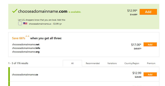
In the United States people always assume the website is a dot com. However you should be aware there are many types of domains available. In this country we have many extensions available to us, these are some of the more common; .com, .net, .info, .org, .biz, .us, .edu, and .gov. Many countries have country extensions on top of that, for example Australia uses the extensions .com.au, .net.au, and .gov.au. Italy uses .it, and Germany uses .de.

Not to spend a ton of time on it, but there are reasons for these extensions. Let’s start with the ones you cannot purchase. .Gov is for government websites, and you cannot purchase these domains. .Edu is for education, and while you can get one of these if you are an educational institution, you cannot just run out and buy one. There are forms that need to be filled out and paperwork to be filed. .Com stands for commercial, although because it is the most common name most companies will grab this domain name first regardless of their use for it. .Net was originally supposed to be for Networking companies, such as ISPs, however it was never enforced, and today it remains the second most common naming convention on the internet.  .Org is designated for organizations, traditionally these have been registered by non-profit originations, however anyone can register a .Org domain name. .Info is for informational websites, .biz are for business websites, and .us for United States based websites. While these are viable options for internet marketing they are not real popular, and less memorable.

Understanding the history & how it works

ARPANET was the predecessor of what we now know as the Internet.  In the 1969 it only had 62 computers connected to it, and all of those computers connected to one another via a numerical address. What later become known as an IP (Internet Protocol) address. As this network of computers grew larger and larger it became apparent they need a better way to connect to one another, and the Domain Naming System (DNS) was created in the 1980s. DNS is a way for computers to find an address by typing a name.  Many companies have their own internal DNS servers on their local networks, and there are hundreds of thousands of DNS servers on the Internet. When you register your domain name, the “registrar” tells all the other DNS servers “Hey I just register www.thiscompanysite.com, and the website & email is now hosted here.” This propagation across the internet can take up to 48 hours, but in most cases with a new domain name it is done in just a few.

Trademarks and Domain Names

Around the world businesses are protected by trademark law, while you think you may be giving yourself a leg up by piggy backing off someone else’s brand, you could be putting yourself in danger of paying large legal fees, and losing all of the effort  you put into building your own brand. Here are a few trademark concepts you should understand before purchasing a domain name.

  • Names that identify the source of products or services in the marketplace are trademarks.
  • Trademarks that are clever, memorable or suggestive are protected under federal and state law.
  • Trademarks that are descriptive and have achieved distinction through sales and advertising can be protected under federal and state law.
  • One trademark legally conflicts with another when the use of both trademarks is likely to confuse customers about the products or services, or their source.
  • In case of a legal conflict with a later user, the first commercial user of a trademark owns it.
  • If a legal conflict is found to exist, the later user will probably have to stop using the mark and may even have to pay the trademark owner damages.


Picking your Domain Name

Alright sorry for all that long windedness, I hope I didn’t lose you. I just felt it was necessary to understand all of that before moving forward.

Keep it Short

Domain names while they become your web presence, they usually are also your email address as well. Keep it short and memorable, preferably your business name. Less than 10 characters is preferred. Consider an abbreviation or acronym of your company name.

Branding

Ultimately you are building your brand, you’re going to be as big as Coca-Cola someday right? Well even if you never expect nor have any desire to ever get that big, Google wants you to build your brand, and that’s where you want to be found. So your brand and your domain name should be one in the same.

Key Words in the Domain Name?

While there once was an internet strategy that promoted websites because the keywords were in the domain name, in late 2012 Google put an update in place that actually penalized companies for using long tail keywords in their domain name. These websites can still be ranked, but a better strategy is to build your brand.

Don’t use difficult words

American’s are ignorant, ok well maybe not all of them, but if you use a word that is difficult to spell, people will have a hard time getting to your page.

Consider the spelling

L and i look a lot alike, especially when the capitalization is reversed and especially when sarif font is not being used. Also 0 and o are also similar in appearance and should be avoided. Using numbers for words might be cute when your texting your friends, but using it for your website is only asking for confusion, and will leave saying “the number 4” when telling people the address.

My domain is already registered

Just because you incorporate your name, you are not automatically entitled to the corresponding domain name.  Even if you trademark your company name, if another company has had an active website on the URL you might face a lengthy court battle trying to get the domain name. You can always check whois, to see who registered your name, and set your calendar to review when the time expires.

I might suggest try using a similar alternative with a hyphen, or perhaps adding the location to the end of it. IE http://Stans-Salvage.com or http://StansSalvageFL.com

Where do I buy my name at?

Well first off you do not buy the name, you lease it. You can lease the name for 1 year or ten, and I highly suggest you put it on auto-renew. Also be sure to use an email address that you are going to keep, as you will want to receive a notification if the credit card on file has expired.

Most companies are priced about the same, and while I do not recommend the hosting on GoDaddy, the names do not get any cheaper than registering with them. You can register your name anywhere, just use a company that has been around for a few years, and do not spend more than $10 per year for an available name.

So I registered my name, now what do I do?

Make sure you keep your login information in a safe place, either yourself, or a web developer will need that information to make it a live website.  Also as mentioned above, these names expire, credit cards expire, and email accounts get deleted.

Who do I host with?

There are a lot of hosting companies out there, it is considered a speed benefit to use a local company to host your website, however in today’s world of 100mb internet connection this is not the factor it once was. Unless you are developing your own website, the person you are working with will probably have a preference.

Domain name scams

Just wanted to mention there a lot of scams out there that will send out letters saying you need to re-register your domain, blah, blah, blah… If you receive a letter like this in the mail, it is probably just a scam, however I suggest logging into your registrar account to verify your account is up to date.  If you have further questions about it, contact your IT person or an attorney.

Conclusion

Well I have just given you plenty of food for thought, I hope you found this information useful. The most important thing you should walk away with is, in picking a domain name keep it short, memorable, and use your company name.

If you have any questions or concern please feel free to leave them below. Any comments with links in them will not be approved.

Read more →

Avoiding Simple Design Mistakes

Many of the world’s websites suffer from mistakes that can dramatically impact their effectiveness. We’ve compiled a list of the 17 common mistakes with helpful advice on how to avoid them.

Many of the world’s websites suffer from mistakes that can be easily avoided. It is our hope that this list will help you to ensure that your site is not similarly afflicted. Some of these problems merely result in irritation, whilst others will inhibit or prevent visitors to your site from accessing the material or functionality that you have placed there.

No matter how well or how poorly your site is implemented, by far the largest mistake occurs when the website’s role in the overall strategy of your organisation has not been well thought through. Only once the strategic purposes and role of the site are understood can the site be built in a manner that achieves those objectives. For a pilot, this is akin to bringing your plane in for a nice, smooth landing only to find out that you’ve landed at the wrong airport.

1. Lack of Accessibility

Accessibility refers to the ease with which a wide spectrum of users can access your site. On one level it can relate to the specialist web browsers that are used by people with a disability – a significant market in their own right. It also refers to the vast array of equipment, operating systems and browsers that are used to surf the web. Some examples to consider include: Visually impaired people surf too: Does the font size on your site increase if a visitor changes the text size from “medium” to “largest” in their browser? Does the page layout of your site fall apart when a visitor changes the text size? Small devices: What does your site look like when accessed from a PDA or mobile phone? How long does your page take to load at GPRS speeds? Other Operating Systems: Microsoft’s Internet Explorer doesn’t run on the Mac or Linux. How does your website design look on Opera, Safari or FireFox? Old Browsers: Believe it or not, there are still plenty of users running browsers that are 4 or 5 years old. A good website designer will take advantage of the formatting and presentation capabilities of the newer browsers, whilst “gracefully degrading” when viewed with an older version. Screen Sizes: There has been an explosion in the variety of screen sizes. Your site needs to be able to display appropriately on different sized screens, and it can’t be assumed that the user will have their entire screen allocated to their browser.

2. Infrequently Asked Questions

Have you looked through an FAQ page and been irritated by the irrelevance of the questions? Have you wondered if the questions had ever been asked, let alone frequently? If so then you’re not alone. Many sites no longer have FAQ pages and have instead updated their content to provide that information. However the point here is not so much about how fashionable the FAQ is or isn’t – the point is that all of the content on your site needs to be relevant to the people who are likely to visit the site. Relevant content will give them a good impression and will increase the likelihood that they will take the next step towards becoming a customer.

3. Can’t find contact information

We’re constantly amazed by sites that make it difficult to find physical contact information. For small and medium businesses this is critical as your contact information provides a key link to reality, giving customers confidence that they are dealing with a real business rather than a scammer. Contact information should include conventional contact methods such as phone and your business address.

4. Click Here To Enter Site

Don’t waste your home page with a “Click here to enter site” link or a gratuitous splash screen. Your website visitor is already here, so reward them immediately with useful, relevant content.

5. Audio

Audio should be used sparingly on any website and it should never be played automatically, especially if you are trying to reach users in a corporate setting. The best sites that use audio require the user to click a “play” icon. For sites that need a voiceover, you will dramatically enhance your organisation’s image by having the track professionally recorded.

6. Too Much Flash

Flash is great when used sparingly and tastefully. Flash can add excitement and movement to your site, adding capabilities that are difficult or impossible using only HTML. Unfortunately it has two key detractors: not everyone has flash and not everyone has the bandwidth to support flash. If you have decided that it is appropriate to use a sizeable flash component on your site then make sure that the user receives visual feedback while it loads.

7. Too many meaningless graphics

The graphics on your site should enhance the user experience. This needs to be kept in balance – enough to ensure that the site is attractive and functional, but not enough to create clutter and slow down the user experience. Site graphics need to be optimised to ensure that the site is displayed at a respectable speed.

8. Search Engine Unfriendly

Whilst having a search engine friendly site won’t guarantee you high rankings on your favourite search engine (that’s a discipline called Search Engine Optimisation), there’s no excuse for not having done the basics. These include having a site map, concise and relevant content, use of standard mark-up tags that are recognised by search engines as well as meta tags such as keywords and a description.

9. Welcome to Our Website

Commence your content with something a little more compelling that “Welcome to our website”. Such an opening appears amateurish and communicates to a visitor that the site is in no hurry to provide them with useful information.

10. Poor Navigation

Navigating through your site should be intuitive. This means that the site navigation should be organised and presented in a manner consistent with accepted web navigation conventions. Stick to standard techniques and standard locations for navigation elements such as links and menus. Links should look like links. It should be easy for a visitor to find the “home” and “contact us” links. As well as having navigation elements that are easily recognised, it is important to think through the logical organisation of your site. One useful metric to keep in mind is the average number of clicks required to find a piece of information or to access a page. Another key aspect is how easy/obvious is it for a visitor to find out which link to click on. For example, to find “double sided tape” on your website, should they look under “Art & Craft” or “Office Supplies”?

11. Poor Color Schemes

A poor color scheme will distract visitors from your message. At worst, the message will become unreadable. It is also important to keep vision impaired users in mind, so if your site features colored text on a colored background then it would be wise to offer a high contrast option. This can easily be done using style sheets.

12. Expecting that people will read your Web Pages

Very few people read a web page in its entirety. Rather, people scan web pages looking for relevant information, zooming in on the elements that catch their interest. It is therefore important that information be well ordered and easy to locate on the page.

13. Pop-up Windows

Unless you have a very good reason, avoid pop-up windows. They are irritating and many browsers block them.

14. Dead Links

All of the links on your site should work. Having users visit your site and encounter broken links will look unprofessional, cause frustration and undermine the confidence of visitors in your site and hence your organisation. All links on your site should be properly tested. Links to external sites that are not under your control should be tested on a regular basis, especially if they link deep into the content of that site.

15. Requiring That Surfers Install Software

Generally, users will not want to install software to view content on your site. By default, most browsers block websites from installing software. Exceptions to this rule are some extensions/applications that have gained widespread acceptance such as Acrobat and Flash.

16. Pages that are slow to load

Web surfers are notoriously impatient and will punish slow sites by leaving them. A good site will load in no more than a few seconds. Reasons for slow loading pages often include such factors as overloading a site with pointless graphics, sub-optimal graphic formats and hosting factors such as using an overseas hosting company or a “backyard” hosting company. If there is a legitimate, unavoidable reason for having a slow site, then provide visual feedback for the visitor while it loads.

17. Not monitoring your site

There are numerous tools available for monitoring your site. They can provide valuable insights into the behaviour of users on your site, allowing you to determine where they come from, how they found your site and the kind of content that they are interested in and which links are the most popular. With excellent tools available free of charge, there is no excuse not to monitor who is visiting your site and what they do once they arrive.

Thanks to the web design experts for this free article
http://www.webdesignexperts.com.au/17-Website-Design-Mistakes-to-Avoid#ixzz2mirJwq00


Read more →

Add Me Fast

Another create promotion tool on Social Media is Add me Fast

It allows you to earn points promoting others to spend promoting your own social media content. I have been using for a few years, and while organic traffic is preferred, most of us don’t have the time to build followings on every platform. Check it out, you’ll be glad you did.

http://addmf.cc/?CB870N5

Read more →